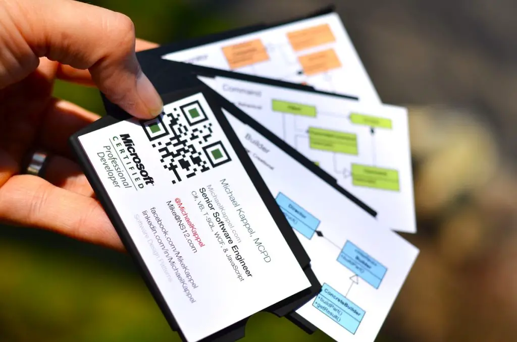
Business cards are small things that make big things happen. Some of the best, biggest, and most successful enterprises in the world began with a handshake and an exchange of business cards. That’s why designing the best printed business card for your enterprise is key to your company’s success.
Yet many professionals underestimate the power of a well-designed business card. You’d be surprised at how many see the printed business card as a mere formality rather than a strategic tool for networking and branding.
“I think, culturally, you’re real and you have a real job if you have a business card,” says Gina Trapani, founder of the influential blog, Lifehacker. “There’s something about that card that means you’re kind of official.”
Post Contents
The Professional Business Card is Here to Stay
Twenty years ago, when people began to realize the power and potential of the Internet to expand and enhance commercial endeavours, there was some speculation that the printed business card was on its way to extinction.
The world of business was about to go digital, paperless and etherbound, people said. The runaway success of companies that made the switch early – Netflix (formerly a DVD rental company), Amazon, eBay, and Apple – prompted every other major brand in the world to go digital.
The printed business card was about to go the way of fax machines and landline telephones, we were told. Soon, there would be no need for you to carry a stack of business cards in your pocket, we kept hearing.
To be sure, much of the world has indeed gone digital. But instead of replacing business cards, digital technology has expanded their design options, utility, and reach.
Why Professionals Still Use Printed Business Cards
“The more high-tech we get, the more we need the ‘soft touch,’” says Bill Vancelette, chief financial officer at the Denver-based business card service, Eagle Direct. ”More people are carrying business cards than in the past.”
True enough, researchers estimate that card-manufacturing companies print around 27 million cards a day in the United States alone – around 10 billion cards a year.
Many of the top companies on the Fortune 500 list, such as Apple, Amazon, Google, Microsoft, and ExxonMobil still issue printed business cards for their top executives.
Warren Buffett, Richard Branson, and Mark Cuban still give out printed business cards when appropriate. So do Mark Zuckerburg, Steve Wozniak, Bill Gates, and former US President Barrack Obama.
That’s because a great card does not just provide contact information. The business card is more than a quaint business tradition.
Your card offers a glimpse not only of the quality of your company’s services but also of the people behind it. In many ways, your calling card is a tactile declaration of trustworthiness. It sends a powerful psychological message.
”It’s the most targeted of all advertising because it is almost always given face to face,” says Colorado-based author and marketing expert Lynella Grant.
Because your calling card sets the tone for all your further interactions with investors, clients, and associates, it should instantly convey professionalism, creativity, and attention to detail to leave a positive “recall” impression.
“Watch what people do when you give them one,” says Vancelette. They pick them up in their hands, they tend to flip them around, they’ll run their hands over the printing.”
5 Creative Design Ideas for Your Professional Business Card
Beyond a good first impression, business cards are also the item that potential clients and partners take away after meeting you.
It’s a tangible reminder of who you are and what you discussed. It acts as an important prompt for making contact again. You can be sure that a poorly designed card won’t serve you as well as it could and should.
“Business cards can still make a powerful impression on prospective clients,” says Kristopher Jones, founder and head of strategy at Zyppy SEO. “I don’t believe email is too informal, but business cards are far more professional to bring to a face-to-face meeting.”
Obviously, graphics perform an important function in business card designs. Before settling on any design idea for your business card, your best route is to learn about the fundamentals of graphic design. For that, your best route is to enrol in a quick course on graphic design.
That said, below are five business card design ideas to keep in mind as you create a business card that best represents you and your professional enterprise.
1. Cards That Impress with Innovative Materials
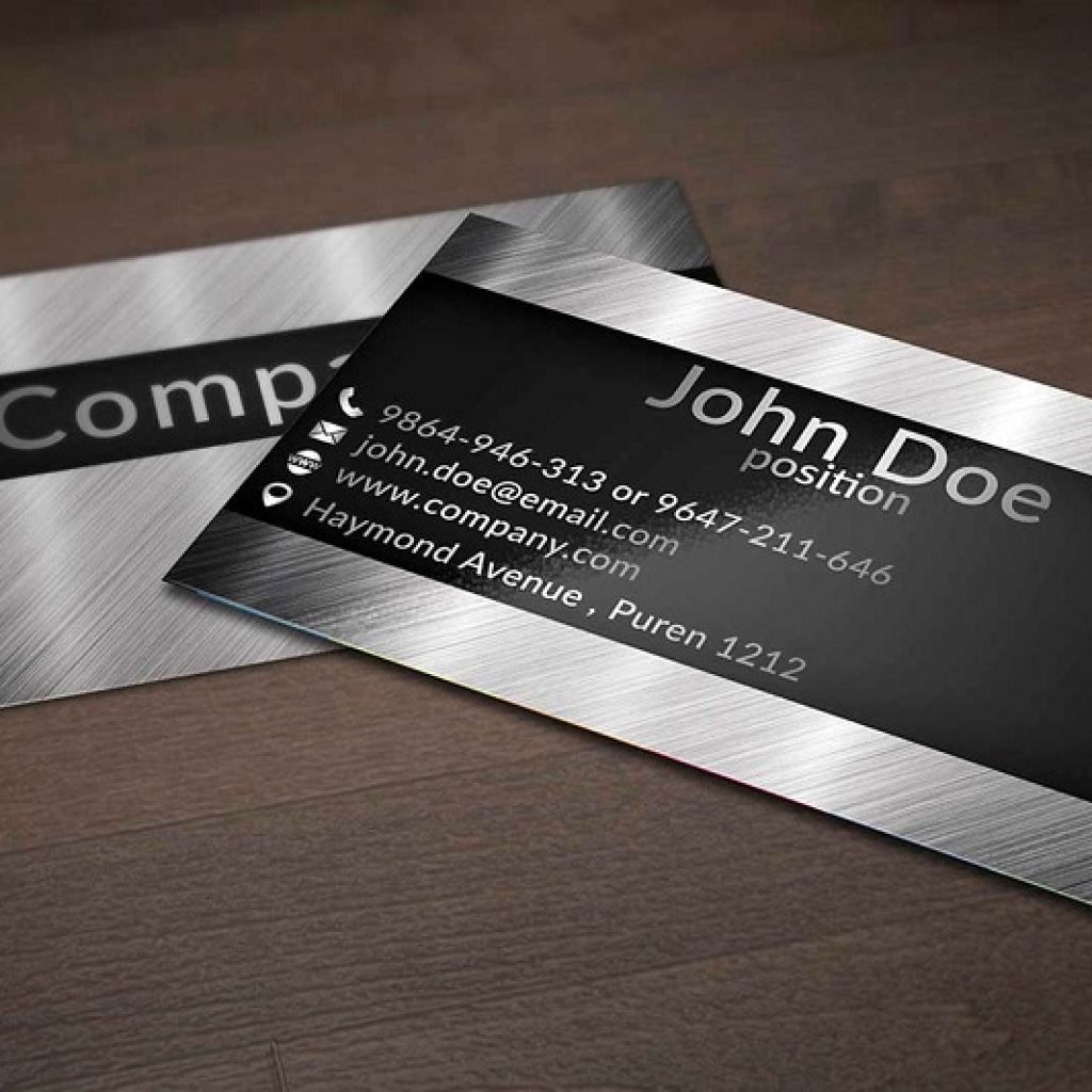
Calling card designs that are meant to communicate innovation and industry take full advantage of new options for business card materials and printing methods.
This design approach is particularly effective if you happen to represent a company that deals in automotive parts, construction, or electronics.
The new materials make it easier for you to show that your enterprise is up to date. Better printing technologies allow companies to engrave their chosen designs on heavier materials like metal or thick, high-quality plastic.
These new printing tricks aren’t just for looks. By using these new techniques, companies can show that the company and its executives are on the cutting edge.
Even simple, modern design styles like a smooth grey finish on metal, with a pop of bright orange or sleek black panels along the edges can communicate the idea of a forward-looking, technology-oriented enterprise.
2. Playful, Visually Dynamic Business Card Designs
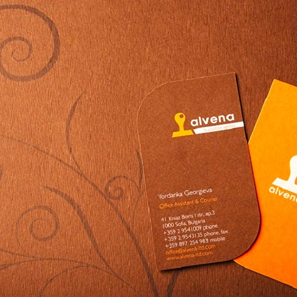
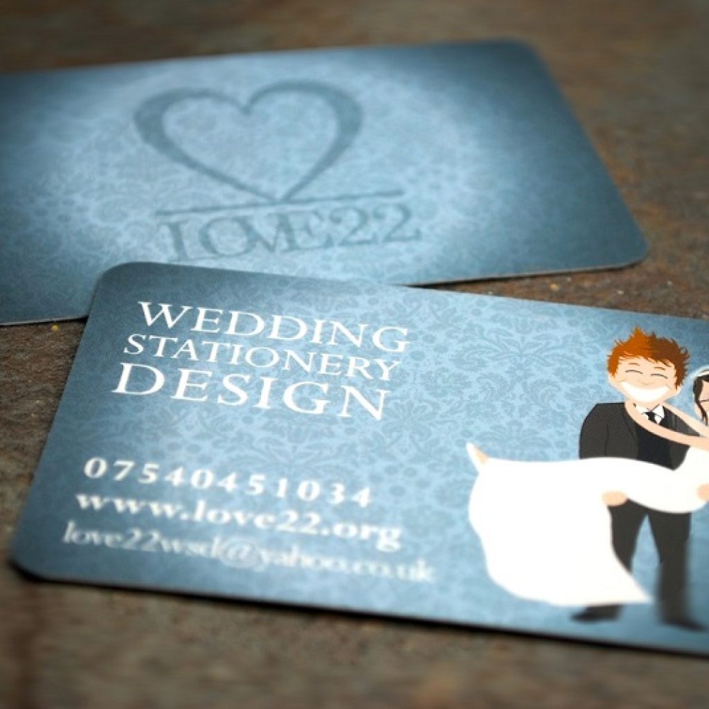
Because so many calling cards can be crammed into the bulletin boards of today’s crowded coffee shops, making your card stand out can be a creative challenge.
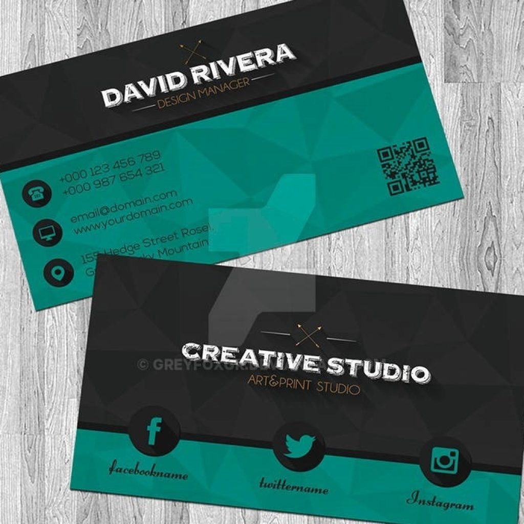
One effective yet overlooked way to achieve this involves the use of vibrant colours and a playful motif. Bright colours can bring cheerful energy to your design, creating engaging patterns with vivid colours and a relaxed layout.
What’s special about this design style is its ability to make clients smile. That design characteristic works wonders, especially for your businesses that build on cheerful messaging.
Playful calling card design styles tend to do well among customers and clients who appreciate a fun, lighthearted, and easygoing approach to business.
3. Minimalist and Understated Card Designs
The purpose of a minimalist calling card is twofold: to make a memorable impression and to communicate professionalism.
By stripping away distractions and focusing on essential elements, a minimalist design allows potential clients basic information while leaving a lasting impression of sophistication and clarity.
The layout is typically uncluttered and has refined aesthetics. The designs often emphasize ample white space and a simple layout.
Calling cards with a minimalist design theme also often use a limited colour scheme. Typically, minimalist designs employ one or two primary colours or shades
Fonts are chosen for their simplicity and readability. Sans-serif fonts are commonly used because of their clean lines, which enhance the overall minimalist aesthetic.
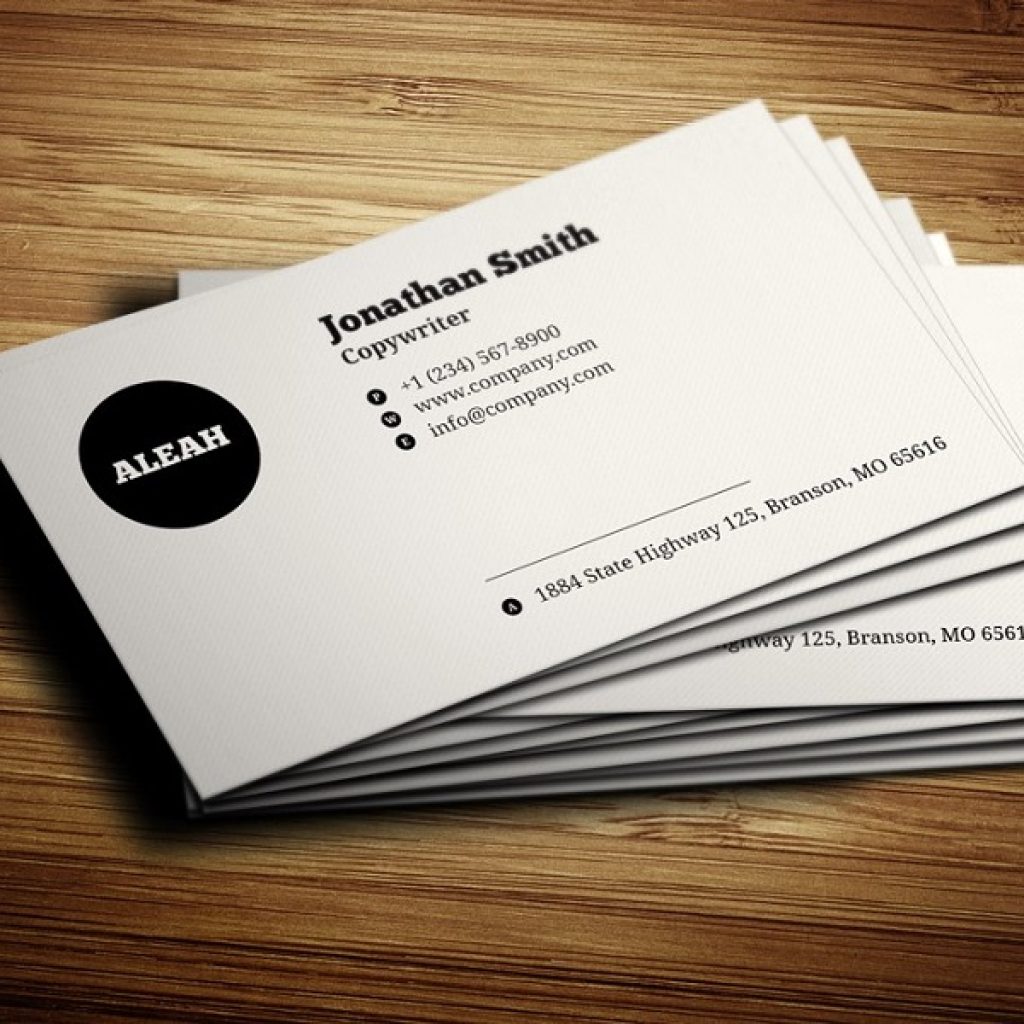
Minimalist business cards are important for making a lasting impact and showing professionalism.
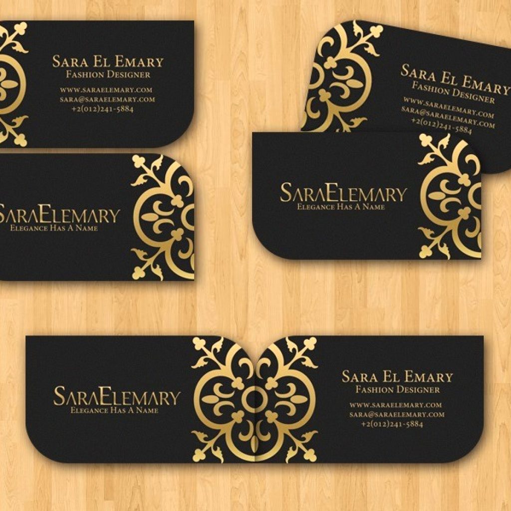
4. Elegant Business Card Designs
Calling cards in the elegant design style emphasizes exclusivity. The purpose is to convey professionalism, refinement, and attention to detail.
The choice of paper or cardstock is crucial. Elegant cards often use high-quality, premium materials such as thick, textured, or specialty paper to create a tactile and luxurious feel.
Elegant card design styles feature carefully selected fonts that project a chic style. Serif fonts or custom typography might be used to evoke a sense of class and tradition.
You will notice a restrained colour palette, often featuring neutral tones or muted colours. Gold, silver, or embossed foil accents may be used sparingly to add a touch of opulence.
The little embellishments, such as foil stamping, embossing, debossing, or subtle patterns, are never overwhelming. Instead, they add depth and encourage visual interest.
5. Interactive Printed Digital Business Cards
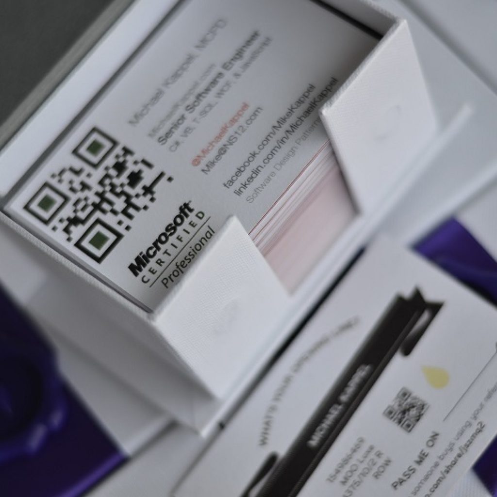
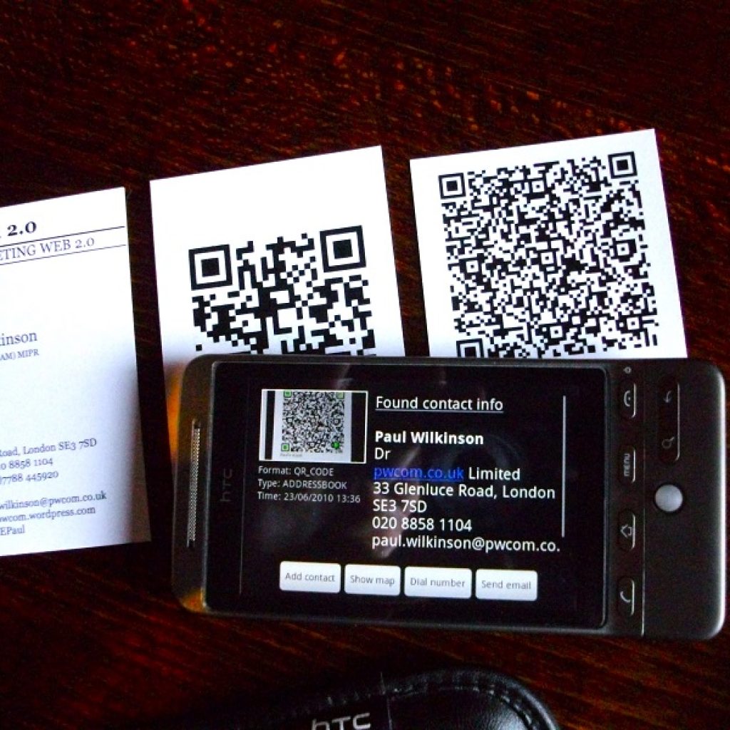
One of the most exciting trends in printed calling cards these days involves the integration of interactive features like QR codes or NFC chips. These enhancements serve to augment the static nature of the conventional card.
For example, business cards with QR codes that permit the card recipient to access various online destinations offer much, much more than your contact information.
With a simple scan of a smartphone camera, your business card can direct prospective partners to a range of online information sources such as social media profiles, detailed brand narratives, or the latest product information.
This design idea extends the reach of the physical card to broader online platforms.
Interactive cards are an excellent way to offer clients a comprehensive insight into your company’s brand identity and services – despite the potential client has just walked away with just a small piece of paper.
A Few Tips and Reminders
Beyond and even before design, long before you get in touch with the printers, be sure your card design provides all the information necessary to make an impact.
One of the worst mishaps that can happen is for you to finally receive your first big batch of printed cards only to discover that they either lack key contact information or they provide incorrect information. Make sure your card has the right address, phone number, and email. If you don’t want calls on your mobile phone, don’t include that number.
It is always good to provide prospective clients and partners with a variety of ways to contact you. Not everyone likes phone calls or uses email. If your business name doesn’t say what you do, add a line explaining it.
For instance, if your brand is a name like “Elmer and Sons, Inc.,” add “Professional Auto Repair Shop” or a slogan to clarify. And if you have a logo, put that on the card.
Black and white is risky as far as design elements for your business card go. These days, nearly 80 percent of the world’s business cards are printed with black ink on white stock.
That’s a huge number of cards against which your design must compete for people’s attention. Using appropriate colours on your card can make it stand out without costing much.
Using Your Card the Right Way
How you present your business card matters more for sales than how they look. Doing simple things, like handing over your card with both hands, can have a big impact and won’t cost you a single cent.
Give your business card to anyone who wants one. Be generous. If there’s a meeting with more than one person, give a card to each of them.
Always have your business cards with you, even when you’re just out shopping for groceries, on vacation, or doing errands. After all, business is about opportunities. You don’t want to miss the next one that comes along.
You never know where you might meet the next partner, the next client, the next investor – or someone else who might widen your business horizons.

